If you ever want to illustrate that software development has gone backwards in the past couple of decades, the late 1990s image editing phenomenon of Kai's Photo Soap can happily serve as your Exhibit A.
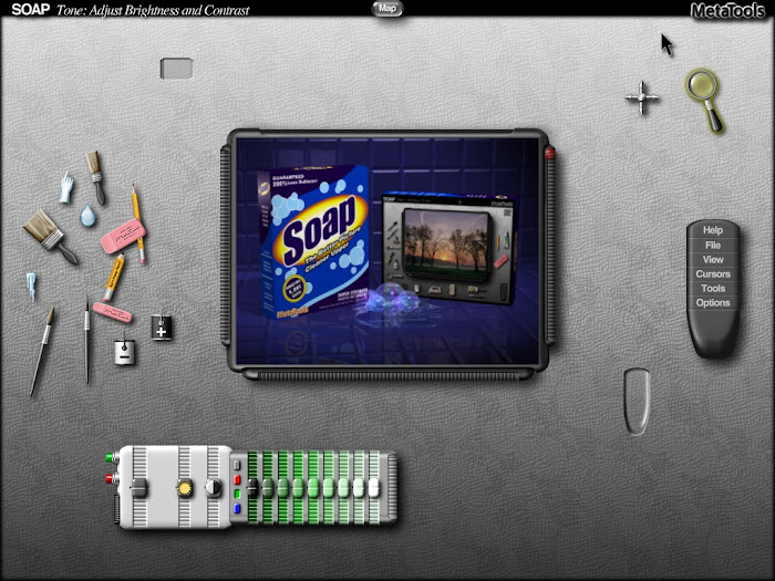
Over time, image editors have become more and more bloated with options and tools. That’s not such a problem if you’re familiar with the package and know where everything is. But if you’re using an image editor for the first time, a crowded screen of tools, mini-windows and menus is likely to prove a brain-frying experience.
Heading back to the 1990s is one way to find simpler image editors across the board. But if you delve into that vibrant era in photo-editor design history, you find that a brilliant solution to interface overload had been developed early on in the timeline. It just didn’t make it to the forefront of industry protocol, and sadly, it pretty much expired with the decade…
Kai’s Photo Soap was a brainchild of the German photo editing guru and software designer Kai Krause. Released by MetaTools in mid 1997, atop the marketing catchphrase “Clean up your image”, Photo Soap came in the wake of other innovative graphics software such as Kai’s Power Tools and Kai’s Power Goo.
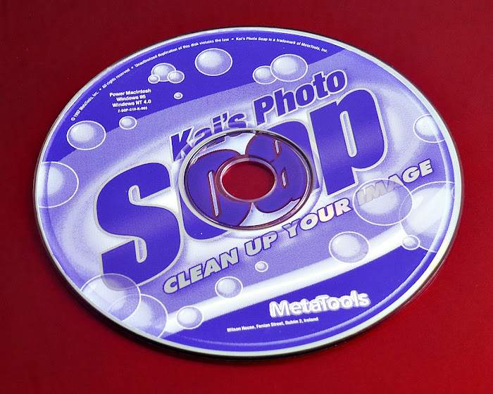
Soap was developed specifically for Windows 95 and could not run in the previous Windows 3.1 or 3.11 versions. Soap also demanded a Pentium processor and at least 16MB of RAM, which, for the average-spending PC consumer, pretty much meant “brand new machines only” at the time of its launch. And there was no floppy disk installation available, so the user’s PC required a CD-ROM drive. Certainly not a given at that time.
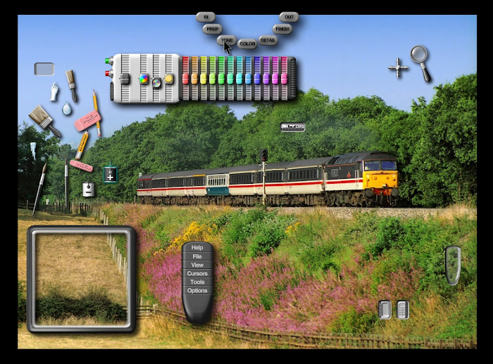
THE ORIGINAL PHOTO SOAP
As its marketing tagline implied, Soap specialised in rectifying flaws or deficiencies in photos rather than heavily manipulating them or changing their content. But it was, and still is, truly the best piece of imaging software ever for one very important task. Namely, turning a thirty or forty year old photo into something that looks like it was taken yesterday. Nearly all of the old 1980s and 1990s photos on my JPEGJuice Twitter profile and Rail Revisited blog, were tone- and colour-vitalised in Photo Soap. I still use it extensively today.

The reason the original Soap program is such a fantastic tool for this type of work is that the architecture, as presented to the user, is one-dimensional, and thus very simple, and very fast. There are no layers. You just throw or paint every modification directly onto the photo. No messing about with brush sizes either, because the brushes’ size changes automatically as you zoom in or out on the image. Want to brush a small area? Zoom in and the brush adjusts to the right spread. Want to brush a large area? Zoom out. It is really, really quick.
Functionally, the colour and contrast controls were a take on Curves and HSL (Hue, Saturation, Lightness). But they were visually represented in a graphic equaliser format, which is easier to control and assimilate than regular Curves and HSL. Commonly used settings could also be stored in user preset buttons, ready to be called up in a single click.
And the aforementioned clever design feature that avoids the migraine of screen overcrowding?… Rooms. Soap was divided into seven separate workspaces, known as Rooms, and easily selectable from a mouseover Map available anywhere in the environment. To make colour adjustments, you go to the Color Room. To make tone adjustments, you go to the Tone Room. To repair flaws, do clones or perform smoothing, you go to the Detail Room… It’s remarkably logical, and had this idea been taken forward at the forefront of digital imaging interface design, it would have made modern editors much more accessible to beginners.
Soap was not an expensive package. In the late 1990s, the UK photographic retailer Jessops sold it for £19.95, and gave it away free with any digital camera or scanner whose undiscounted price was over £250. Discounts meant that Soap was sometimes given away for free with hardware costing less than £250.
ENTER SOAP 2…
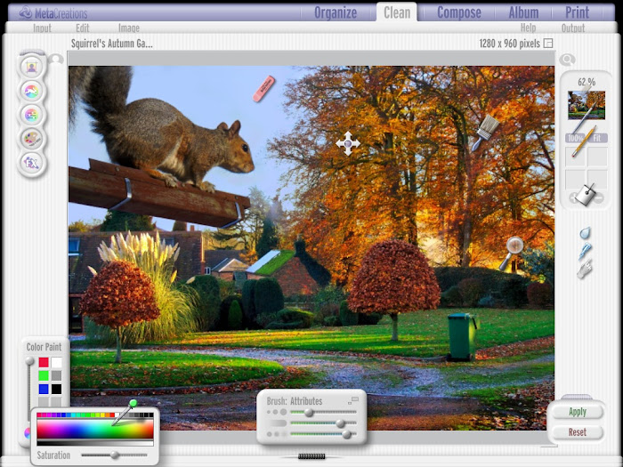
A second version of Soap – Kai’s Photo Soap 2 – was launched in December 1998, with the vendor now going by the name of MetaCreations. The Soap 2 package immediately won a Best of Show accolade at the January 1999 MacWorld. The new version (really more of a new program than a mere new version) maintained a UK retail price of around £40, and vastly broadened the scope of Soap, pushing well into the realm of cutting edge web publishing. It could do some amazing things for its time.
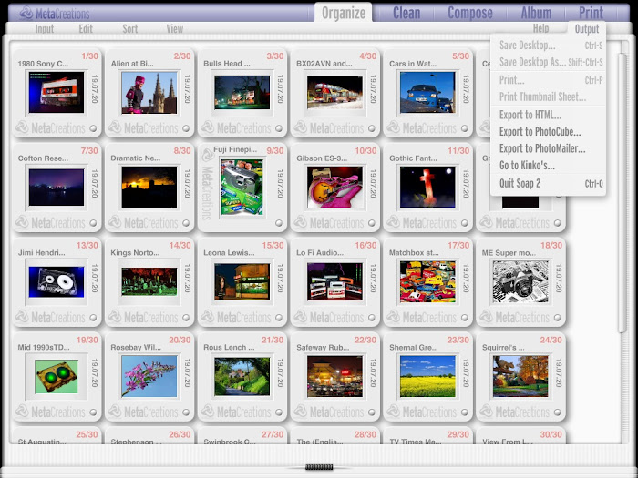
Soap 2’s fast creation of photo albums and ability to instantly convert them into interactive HTML web pages was incredibly exciting in the late 1990s. It could also create lightbox and contact sheet compilations as interactive web pages, which opened up each slide as a full page image when clicked. Flash animation effects could additionally be published as web page content. And the web pages didn’t necessarily have to go onto the Internet. Users could run them on their desktop, for their own pleasure.
Unlike Soap 1, Soap 2 could stack layers, it had a multi-level undo function, it facilitated pane resizing, and it could handle more than one image at a time. Its graphical environment was also dramatically revised to look much brighter and more modern - with conventional menus rather than a Room Map. And it allowed minimising (although still not scaling) of the main window, which had not been possible in Soap 1.
Other new features in Soap 2 included Magic Mask – a brilliantly simple way to apply a modification to an object-specific area without the need for any painting. For example, you could colour-boost a blue sky without altering the rest of the landscape, simply by setting a level of saturation and then clicking on the sky with the Magic Mask tool. Remember, we’re talking here about the 1990s. That sort of power in a single click was almost unheard of at the top of the price range, let alone in a beginner’s package.
Another major advance in Soap’s capability with Version 2 came in its ability to use actual Photoshop filters. This was a really big development, because the Soap architecture wasn’t like that of Photoshop, and it enabled the filters to be used in different ways. In Soap 2, Photoshop and other third party filters could be painted or Magic Masked onto an image, with any level of opacity. The same effects could be achieved in Photoshop, but not without the use of Layers or more intricate selection processes. Once again, Kai’s Photo Soap was turning complex tasks into instant processes for the consumer desktop.
In fact, Soap 2’s filter capability was bolstered further with the inclusion of some Kai’s Power Tools components. Texture Explorer, Planar Tiling and Twirl 3.0 shipped as part of Soap 2 and would appear in the plugins menu along with everything else you chose to add from your Photoshop Fliters folder…

However, Soap 2 lost some of the editing subtleties that had been available in the original Soap, and was not as intuitive for complex colour and tone work. The graphic equalisers in Soap 1 had been given a sympathetic flowing action, so that when you moved one slider, adjacent sliders modestly moved with it. Like the action in Curves. But in Soap 2 the equaliser sliders moved singularly, with no adjacent compensation, and this could create undesirable, hard splits in the colour or tone spectrum. The equaliser system was no longer idiot proof. And the Room architecture was not as well defined in Soap 2 as it had been in Soap 1.
Nevertheless, Soap 2 was clearly a bid to woo absolute beginners, and it came with a huge, 176-page PDF how-to manual, which is essential reading if you want to make full use of the product. For forty quid, the whole thing was a behemoth of an imaging program, and its one-click novice options meant it could make impactive changes like this in less than a minute…

Nothing in the price range of Kai’s Photo Soap could touch it for features and capability. It wasn’t designed to create outlandish fantasy images. But in its day it was the best image revitalisation and enhancement tool in the world. If you give me an old, washed out photo and ask me to make it look like you took it last week (and you also hand me a wad of bank notes, obviously), I WILL use Kai’s Photo Soap, and I don’t see that changing in the near future.
USING KAI’S PHOTO SOAP ON A PC TODAY
Unfortunately, both Soap versions have long since ceased to be compatible with a current Windows version. They work perfectly in Windows 95 and 98. Soap 1 also works without errors in Windows ME and Windows XP. Soap 2 will install and work in ME and XP, but will probably produce errors and crash occasionally. Neither version will install directly into later Windows systems, so you have to run them inside a virtual machine with software like VirtualBox.
Both versions run perfectly well in VirtualBox with a Windows 98SE guest operating system. And you can network a shared Windows folder between your guest and host OS, so that your image files can be transferred in and out of the virtual machine. Don’t use VirtualBox’s shared folder because it won’t work with Windows 98. Set up an ordinary Windows network via VirtualBox’s Host Only Adapter and simply create and network-share a folder in your virtual Windows 98.
[UPDATE - March 2022: I was recently able to get both versions of Kai's Photo Soap running nicely in Linux Mint. Mint is a free operating system, which comes packaged to install as a dual boot with Windows. If you have the disk space, you can have both systems on the same PC and select which one you want to fire up from a boot menu. Mint can see your Windows installation, so when you boot to Mint you can just grab image files directly from Windows and put them back there when you're done. After installing Mint, you'll need to install the Wine environment from the Software Manager. With Wine installed, you can run Windows programs directly in Linux, and I've found that Mint + Wine will take a range of Windows oldies that Windows itself will not entertain - including Photo Soap. Soap 1 was a bit buggy initially, but in the settings for Wine you can enable a virtual Windows desktop. With that enabled, both Soap versions ran bug-free.]
Keep Soap alive!