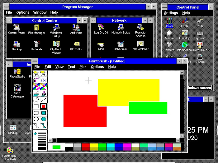
Give your old Windows 3.1 or Windows For Workgroups 3.11 installation a facelift, with the info and download from this post...

It may sound like a superficial detail, but the visual theme you use on your PC is tres important. It's the virtual world's equivalent to the decor in your home. It affects your psyche, so it needs to be welcoming, attractive and conducive to positive thought. In fact, the refreshing visuals are one of the reasons we return to old computing systems.
In XP, Windows stored its user theme customisations individually, as *.theme files, making the designs easy to transfer and share. But the previous Windows 4 series - incorporating 95, 98 and ME - was a different matter. Windows 4 themes (or "color schemes", as they were known back then - to distinguish them from the broader concept of Desktop Themes) were extremely difficult to share. That's because they were primarily stored as part of the USER.DAT file.

The problem with that? USER.DAT held other information about the system, and so could not simply be transferred wholesale from one PC to another. And because USER.DAT was formed of code rather than regular text, the average user could not edit lines in the file either.
However, taking a step even further back, to Windows 3.1, and its network-ready sibling Windows For Workgroups 3.11, we find the Color Schemes easier to import and export.
As in the Windows 4 series, 3.1's color schemes were not stored individually - they were stored communally in a muti-purpose file. In this case, CONTROL.INI. But unlike USER.DAT, CONTROL.INI was a simple text file, meaning that in Windows 3.1, the user could play around with the [color scheme] definitions block. By entering the CONTROL.INI file, you can insert a set of pre-made themes, like the ones I'm introducing in this post, or rename existing themes, or change the selection order of the themes as they appear in the Control Panel > Colors dropdown. None of those tasks were possible using 3.1's standard user interface.

CONTROL.INI
In Windows 3.1, CONTROL.INI resides in the C:\WINDOWS folder. You can easily navigate to it via Control Panel > File Manager, and then double click it to open it.
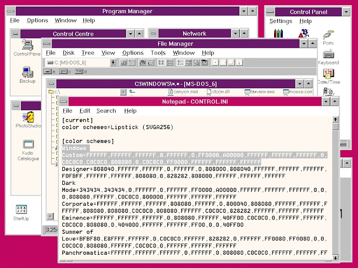
When you open CONTROL.INI in 3.1, you'll see a section headed with [color schemes], and in that section, each scheme appears on a separate line, beginning with the name of the scheme. like this…

IMPORTANT!
Before you make any modifications to CONTROL.INI, save a copy of it as CONTROL.BAK or CONTROL.OLD, so you can restore the original file if anything goes wrong. CONTROL.INI should open in Notepad, and by default the color scheme definition lines will be too long to display within the page width, so it's a good idea to set the Word Wrap active. You do that via the main menu: Edit > Word Wrap. See below…

Once you've got Word Wrap engaged, the whole of each line will fit within the page width, and you can see exactly what you're editing. These screen shots show the actual code you'll be pasting into the file, and its position immediately below the [color schemes] heading. In the screen shot below, the area of code selected in grey relates to one theme. You can see how the next line starts with the name of the next theme. The order of the themes in Control Panel > Colors refelects the order of the lines in CONTROL.INI, so it's possible to change the order of the themes' appearance in Control Panel > Colors by cutting and pasting the individual lines of code to new positions in the list…

UPGRADING YOUR WINDOWS 3.1 THEMES
Most of the original visual themes or "color schemes" that came with Windows 3.1 were not very co-ordinated as regards colour design. That's part of their charm, and the vivid Hotdog Stand theme became famous for its spectacular impact. However, most users have tended to stick with 3.1's only hardwired and undeletable theme - Windows Default. The themes downloadable via this post aim to impart a different feel, which combines the colour co-ordination of Windows Default, with the design variation of some of the other themes.
One of the issues with creating themes for 3.1 is the limited range of colours. (Quick note - I'm English so I spell it 'colour' when referring to colour in general, but I'm spelling it 'color' when referencing Microsoft's terminology). Windows 3.1's palette uses only 16 colours. You do see more than 16 selections in the palette, but that's because Windows mixes pixels of different colour values to create an illusion of more shades. The individual pixels are still only displaying one of 16 colours. If you look at the Basic Colors chart below (accessed via Control Panel > Colors), you can see how some of the shades have an obvious patterned effect…

In fact, if you look closely at full size, you'll see that most of the shades are patterned, and only 16 of them are not. The patterns are formed by the mixtures of different coloured pixels. The greater the difference in the pixel colours, the more pronounced the pattern. We have to remember that digital colour reproduction was still in its infancy in the early 1990s, and that causes us a number of problems if we want to create a relatively modern appearance for Windows 3.1. There was no such thing as a JPEG when 3.1 was developed, so we can't use JPEGs for the desktop wallpaper. We have to use 8-bit (256 colour) bitmaps instead. You'll find those in with the download.
Another issue we face is that the themes which look their best in 256-colour mode won't necessarily look as good in 16-colour mode. And odd as it sounds, also vice versa. In the theme set I've created for this post, there are two themes that were made on a 16-colour setup, which to my surprise did not look as good on a 256-colour setup. Windows actually selects two different palettes for the 16- and 256-colour modes, and some colours available in the former are not available in the latter. For this reason I've included two versions of the Shamrock theme, and two versions of the Lipstick theme. They're marked with their intended mode: either VGA16, or SVGA256. You can still use them in either, but they'll look best in their designated mode.

You can check which mode you're in by going to Windows Setup > Options > Change System Settings. The top dropdown in the dialogue will show you your graphics setup. If it just says VGA, with no info about the number of colours, you're using 16. If you're set to 256, the dialogue should say so, and will identify the driver as Super VGA.
ADDING THE NEW THEMES
To get the theme upgrade set, hit he link below. It's a direct link, so the download will begin immediately. You'll get a zip folder containing a disk img file for use with a virtual machine, and the individual components for use if you're going to install to a real PC.
Windows 3.1 and Windows For Workgroups 3.11 New Themes Kit (ZIP format)
Windows 3.1 and Windows For Workgroups 3.11 New Themes Kit (TAR.GZ format)

The main zip contents and the img file have the same components, which are…
A text file whose contents you can add to either the beginning or the end of your [color schemes] definitions block in CONTROL.INI. My recommendation would be to insert the contents of the text file immediately below the [colour schemes] heading. Then just save the file and the color schemes are ready to use. They'll appear the next time you go to select a theme in the Control Panel > Colors dropdown.
To complete the themes, there are also three 8-bit bitmaps in the download. They are…
- Love.bmp (for use with the Summer of Love theme).
- Corporat.bmp (for use with the Corporate theme).
- Eminence.bmp (for use with the Eminence theme).
Copy them all to the C:\Windows directory.
You then load them via Control Panel > Desktop. That will bring up a dialogue with a setting for Wallpaper. Load the appropriate image for the theme you're using, and then make sure you select the "Tile" radio button just below. It won't matter if you're only using the standard 640 x 480 resolution, but if you go up to 800 x 600 or 1024 x 768, the images have to be tiled to fill the full desktop area. Of course, you don't have to keep the wallpapers with their designated themes. You might want to try them with other options.
SUMMING UP
It's obviously a challenge to bring an early 1990s operating system up to date after nearly thirty years of development. But it's most gratifying getting meaningful use out of something most people have long since consigned to the unusable category. Perhaps the biggest shock to the system today is Windows 3.1 and most of the image editors designed to work within it, not knowing what a JPEG is. But finding those other solutions is the thrill of retro computing. Having nice visual themes just adds to the joy.